Score over time
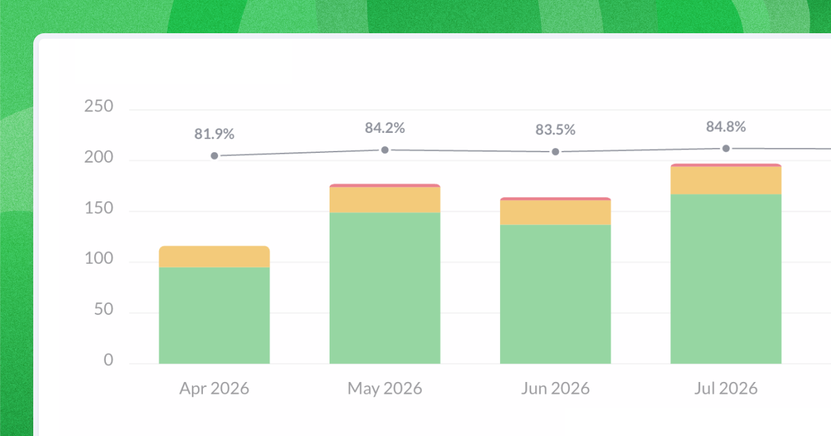
Your score now shows as a line on the Answers over time chart, one point for each day, week, month or quarter. Set the range to Last 365 days and pick Month, and you have a year of monthly scores in one chart. Download it as a PNG and the line comes with it, ready to drop into this month's report.
If you've been building that chart by hand, stepping the date filter back a month at a time and copying each score into a spreadsheet, you can stop.
Every point is that month's own score. Where the dashboard's 90-day moving average blends a bad month into the ones around it, the new line shows it as a bad month, while there's still time to act on it.
You'll find the line on the chart in a survey's Questions tab and on the Answers over time widget in custom dashboards.